 News
News
The Fédération québécoise des massothérapeutes agréés gets a makeover: Discover the FQM’s new brand image
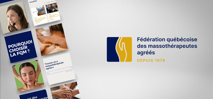
In a world where image and digital presence have become increasingly important, we at the Fédération québécoise des massothérapeutes agréés (FQM) have embarked on a bold voyage of renewal. The presentation of our new brand image, which pairs elegance with innovation, represents a significant turning point not only for our organization, but also for our members and the massage therapy profession as a whole in Québec.
In this blog post, we invite you to join us for a deep dive into the behind-the-scenes work that went into this transformation. We had the pleasure of sitting down with our President-Executive Director, Mr. Maroine Bendaoud, who shared his inspirations, along with some anecdotes and details on the reasons for the change. From the development of our logo to the improvement of the user experience on our website, you will discover how these innovations embody the FQM’s modern and caring vision for the future of massage therapy in Québec.
Interview with Maroine Bendaoud, President-Executive Director of the FQM
Maroine, can you begin by telling us why the FQM decided to refresh its brand image?
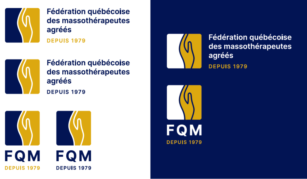
Our previous logo was starting to show signs of aging. We wanted to revamp our image in favour of something more modern and lively. It was also essential that our new members be able to easily integrate this new image into their communications media, including their websites and business cards.
Where did you draw your inspiration for this new design?
Our former logo already featured hands to symbolize touch, which is essential to our profession. We wanted to keep this idea while improving the definition of the hand in the new logo. After all, touch is the main tool used by our massage therapists and kinesitherapists.
Can you share an anecdote that marked the creative process?
Yes, in fact, a funny thing happened during a Zoom meeting. Describing our current platforms to Stéphane from Mademoiselle Rouge, the firm that helped us throughout the process, I compared our former Members’ portal with a “Soviet artefact”, and knowing about Stéphane’s taste in music, I told him the time was ripe for a “Wind of Change”, which provoked a burst of laughter!
Speak to us, if you will, about the logo’s new colours and design. Do they hold any particular significance?
Certainly! The hand in our logo symbolizes the caring approach of massage therapists. The curves you see in our publications are inspired by the logo and are meant to evoke hands on a human body. We wanted our image to represent the essence of massage therapy and its impact on well-being, all with an aesthetic and elegant touch.

How do these changes improve the user experience, whether the user is a massage therapist or a client?
We made several improvements to ensure that the website is more user-friendly, both for our members and the greater public. For example, the module “Find a certified massage therapist” was streamlined.

In addition, our members’ Web profiles were rethought to highlight their personal brand image, with links to their social media networks included to boost their visibility and their client base.
Do you think this new image will influence the future of the FQM and its members?
Our hope is that it will consolidate our position as a leader in the field. Since the FQM’s inception in 1979, we have strongly advocated in favour of a level of excellence. This renewed brand image is a further step meant to maintain this excellence.
If you had to describe the new brand image in three words, what would they be?
I would say: streamlined, innovative, and refined.
Finally, what were the initial reactions after the new image was unveiled?
The reactions were extremely positive. Our new graphic charter, based on the logo and the colours, really allows us to stand out. We can say that this new image lends us a much more distinguished and professional look.

In conclusion
Our enthusiasm and determination to move forward are reflected in this new stage marked by the renewal of our brand image. This transformation is not limited to an aesthetic makeover, however, but is also symbolized by a major evolution in the way that we at the FQM interact with our members and the greater public.
Our new brand image is not simply a symbol of change. It reflects our adaptability and continuing commitment to development and growth. By placing the emphasis on a more intuitive and accessible approach, we are opening new avenues for our members and offering them improved tools with which to increase their visibility and professional effectiveness. For the clients, these changes will be reflected in a more seamless and rewarding experience, thereby facilitating access to superior-quality care.
This interview with our President and Executive Director, Mr. Maroine Bendaoud, clearly demonstrates our commitment to reinforcing our mission to support and promote excellence in massage therapy in Québec. With this new image, we assert our position as an industry leader as well as an innovative and dynamic partner ready to meet future challenges and continue innovating on behalf of our members and the broader community.


